Fledgling Auckland design agency Tried & True has been charged with giving our number one chicken brand a new look. Tried & True has already been involved in rebranding work on Fonterra, Pernod Ricard, United Fisheries and Pask Winery. But getting Tegel is a real feather in its cap.
The scope of the refresh includes packaging for both domestic and international markets, and related corporate collateral. For Tried & True, being entrusted with the care of rebranding New Zealand’s biggest poultry company is a huge coup for the agency.
“Tegel is an iconic Kiwi brand. We are incredibly excited to be in charge of one of New Zealand’s largest complete brand refreshes,” says Tried & True’s creative director Andrew Sparrow, who set up the agency with business partner Trudy Hunt in 2014.
Angela Irwin, Tegel’s head of marketing, says the project is a significant one that reaches across the entire organisation.
“The new brand design gives Tegel a contemporary new look, uniting all our products under a common framework. The new design, photography and on pack messaging will excite shoppers in store.
“We chose Tried & True for their experience, capability and creativity. We had confidence that Andrew and Trudy would deliver a design that enhanced Tegel’s position as the number one poultry brand in New Zealand,” says Irwin.
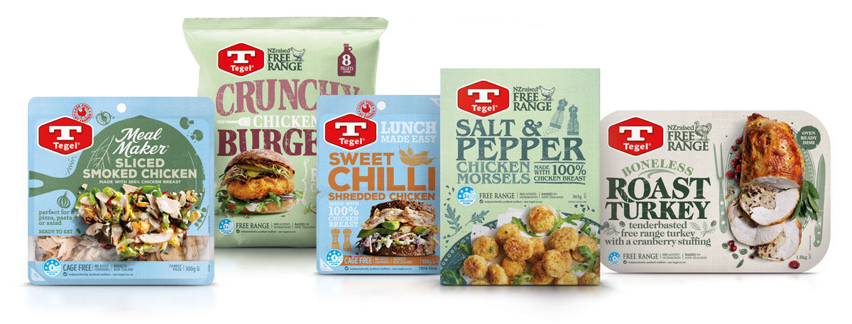
Tegel’s packaging is a major component of the project, involving more than 200 different products across the supermarket.
“Over time the previous packaging featured a number of different looks across a wide range of product groups,” says Hunt.
“Our job was to tell Tegel’s story and re-ignite the brand by giving it a heart and soul with a dynamic family look. The design solution needed to be flexible enough that it could span different ranges and sub-brands, but still retain the strong product identity that consumers are so familiar with.
“Our biggest challenge was the Tegel blue, a defining characteristic of the brand and packaging, and well known by New Zealand shoppers. Rather than trying to change that, we embraced the blue, moving it on from its current deep blue to a softer, textured blue. This enabled us to use a myriad of colours and imagery to bring the design to life.”
“We came up with an exciting new brand look that is adaptable across categories and products. We worked with illustrators and photographers to make a graphic story. The result is a strong, unique system incorporating colours and a reworked logo that can instantly be recognised as Tegel throughout the supermarket,” says Sparrow.
Share this Post