AUCKLAND, Tuesday: Following a competitive pitch in August, Motion Sickness has been appointed as the lead strategic, creative, and media agency for furniture & beds stockist Big Save Furniture.
To mark the beginning of the partnership, Big Save has launched a campaign under the brand’s new platform — Prices That Make Sense — which aims to prove to customers that what they’re paying for is fairly priced and built to last.
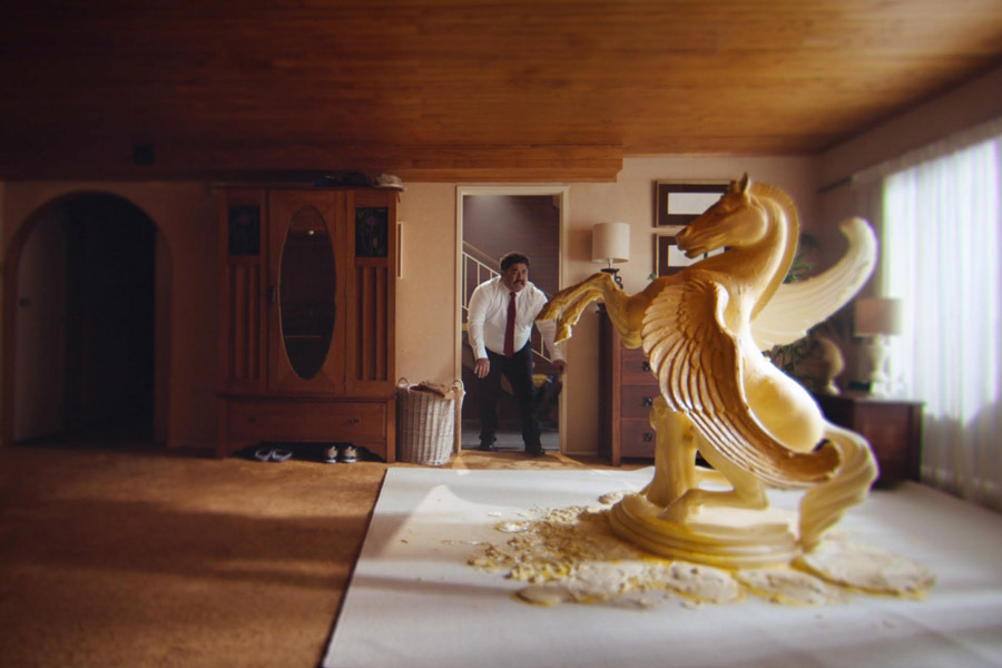
Big Save head of markeeting Lily Salter said: “The hero film to launch the campaign explores the exaggerated ponderings behind a price tag, comparing a sensibly priced Big Save mattress to a similarly priced (yet far less sensible) butter sculpture.
“We have been blown away by the creative talent at Motion Sickness and their strategic approach to our brand. Since the refresh over the last two months, we have already seen a lift in awareness and consideration, as well as plenty of excitement and engagement from both our customers and our Big Save team nationally.
“In-store sales have also been the strongest in years. With our amazing brand campaign only launching last week, we can’t wait to see how things go.
“The brand campaign is just one facet of a complete Big Save refresh that extends all the way to a revamped in-store experience.
“We’re excited to build on this platform over the next few years to see how big we can grow this brand.”
“Receiving a pretty much open brief from Big Save furniture was exciting, but also a daunting challenge.
“We needed to modernise their identity and reinvigorate an iconic 30 year old brand. The business built its success on the unexpected. Whether it was Lily driving a golf cart down the isles, staying open until midnight for a sale or ordering too many beds.
“The spirit of Big Save was fun and wasn’t really broken.”
“We’ve landed in a space that feels fresh, modern but undeniably Big Save Prices That Make Sense is fun, comically self aware and still a little bit mad.
“We’re excited to build on this platform over the next few years to see how big we can grow this brand.
“As part of the fresh look, Motion Sickness renovated a number of the brand’s core elements including a slimmer, simplified logo, a refined color palette and a consistent visual identity across everything from in-store branding to delivery trucks.
- New website: motionsickness.co.nz
- See more of the work here
Share this Post


