
AUCKLAND, Today: Big Communications, with Simon Byers Design, has unveiled the biggest overhaul of the Barfoot & Thompson visual identity in over 40 years.
Barfoot & Thompson MD Peter Thompson says it’s the perfect time to make the change. “Having recently been voted the best real estate agency in the world, and with our 100th anniversary on the horizon, we want to make sure that we have a modern and aspirational brand to take us into the future,” he said”.
B&T CMO Chris Andersen said: “The case for a rebrand was clear. Our customers were telling us that the brand was looking a little tired, a little old fashioned. More importantly, our own people were saying the same thing.
“It’s a huge undertaking and one that will roll out over several months. We’ve got 78 branches in Auckland and Northland, a large vehicle fleet, hundreds of different signs and pieces of collateral. We think there are well over 3000 elements that will need rebranding – and many more out in the community at branch level that we might not yet have visibility of.”
Big MD Ant Salmon said: “Having Simon as part of the team worked really well. He brought a fresh set of eyes to the brand and sound design thinking.”
“This was not a company needing to totally re-invent itself. The look still had to be recognisably B&T, but slick and modern.”
Big CD Joe Holden said: “The nature of the project was clear from the outset. This was not a company needing to totally re-invent itself. The look still had to be recognisably Barfoot & Thompson, but slick and modern to reflect the company they have become.
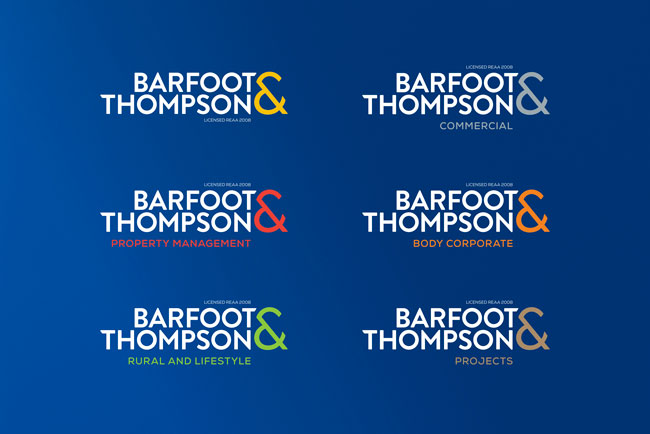
“For the logo, a contemporary geometric font – all in uppercase for a cleaner look – was customised with unique touches. The new ampersand’s distinctive angular form makes a striking design statement.
“The blue was updated to navy, the logo colours reduced to two and the blue box has been retired to increase the logotype size on smaller formats like mobiles. Also, the ampersand’s angle is a recurring device across a wide range of branded assets.”
“Importantly, the new brand architecture includes sub-branding for the company divisions,” Salmon said.
“Property Management, Commercial, Lifestyle and Rural, Body Corporate and Projects each now has its own logo and accent colour.”
The application of the new branding across all the assets has also been a joint effort, with the Barfoot & Thompson in-house studio team instrumental in developing the brand’s guidelines and rolling out many of the elements.
CREDITS
Client: Barfoot & Thompson
Chief Marketing Officer: Chris Andersen
Research: DTK International
Agency: Big Communications
MD: Ant Salmon
Design team: Big CD Joe Holden, senior art director: Mike Knight
Simon Byers Design: Simon Byers
Share this Post