Two Auckland ad agencies – Colenso BBDO and Special Group – were among the stars at the Best Design Awards, unveiled on Friday night.
Both picked up Golds. Special also picked up a Silver, as did Strategy, TBWA, and RUN.
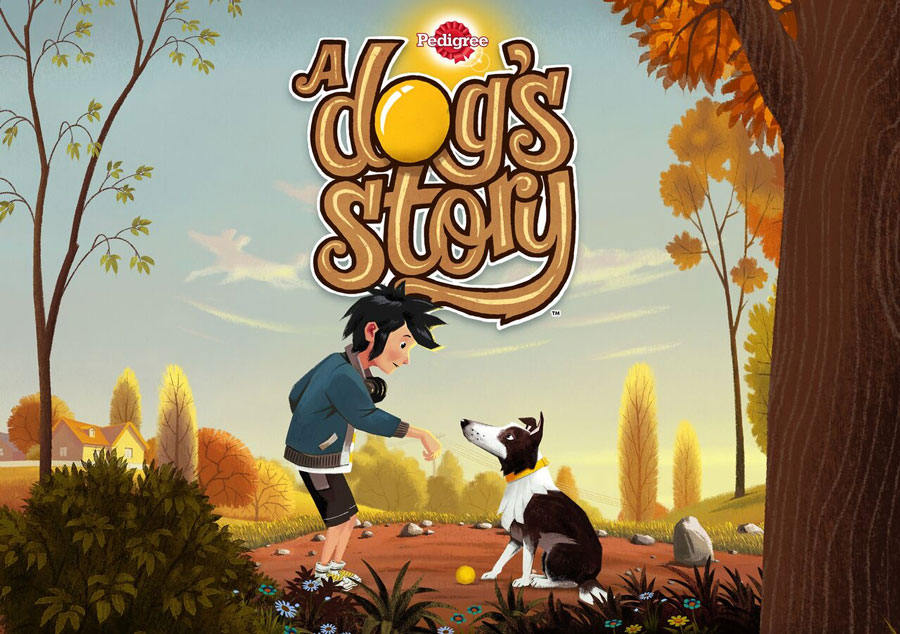
A Dog’s Story by Colenso BBDO and Watermark Ltd – Gold in Applications, Bronze in Illustration, Bronze in Public Good
A Dog’s Story is an interactive adventure that teaches children how to better understand dog behaviour. Created in partnership with Auckland City Council and leading animal behaviourists, the app teaches children how to meet a dog, pet a dog, and read body language.
Since launch, kids have spent a total of 2503 hours on the app, with an average session length of seven minutes.
The judges said: “It was a great concept for its intended audience that is animated, educational, and fun. It’s age-appropriate while still appealing to all ages.”
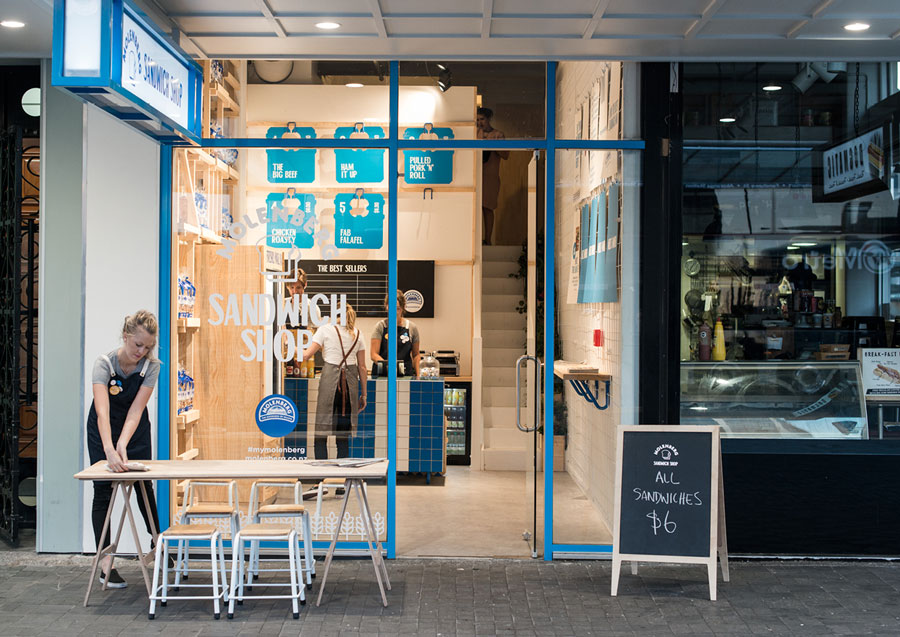
Molenberg Sandwich Shop by Special Group – Gold in Hospitality, Silver in Environmental Graphics
Not everyone has a great novel in them, but everyone has a great sandwich. Special Group created a competition to get New Zealanders to make their best sandwiches and designed a shop to sell them in.
“We set out to create a bright, welcoming sandwich shop at 2 Queen Street in Auckland to attract as much commuter footfall as possible, and to remind customers how exciting sandwiches can be,” said an unnamed spokesperson for the agency.
Everything from typography to aprons to fixtures to packaging to staff personalities was tailored to share a fresh Kiwi goodness experience, they said.
The Sandwich Shop campaign reached over 3.5 million people, selling thousands of dollars’ worth of sandwiches in its six weeks, driving a sharp increase in Molenberg sales across the country.
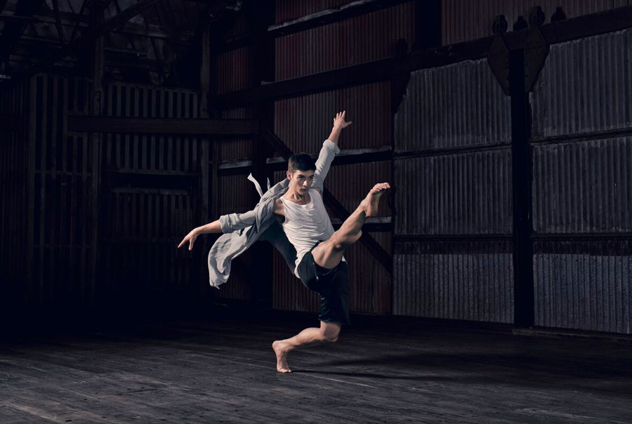
RNZB 2016 Season Brochure by Special Group: Silver in Photography
At the end of 2015 the Royal New Zealand Ballet welcomed a new artistic director, Francesco Ventriglia, from Milan who wanted to bring a new vision to the 60-year-old ballet by re-framing the beauty of balletic form and tradition.
Special Group teamed up with NZ’s fashion design community including Miss Crabb, Zambesi, Huffer, Workshop, Nom*D, Ruby, Kowtow, Kate Sylvester and Karen Walker to showcase RNZB’s new season along with theirs.
To further highlight the beauty and elegance of dance and fashion, the images were shot inside the rough, vacuous warehouse space of Shed 10 on the wharf.
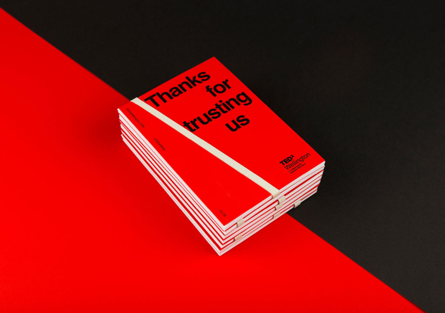
Thanks for trusting us by Strategy Design & Advertising – Silver in Design Communication
When TEDxWellington 2016 was announced, only the theme of ‘trust’ and the date of the event were made public. The tickets were put on sale with all of the speaker details and location kept entirely secret.
This resulted in one of the fastest ever sell-outs with tickets gone within two minutes of going on sale. On the day, three red double decker buses transported the excited delegates to the venue with the windows completely blocked out. Photography within the venue was also strictly prohibited with only the official photographer allowed to document the experience.
At the end of the day delegates received a photographic memento in the form of fifteen A5 cards bound together by a rubber band. Each speaker card was designed to include an image of them on stage taken during the day and then printed on site before being assembled into packs and distributed to delegates.
The layout of the photos was designed to evoke the feeling of a set of polaroids which the delegates could flick through in their hands as they shared their experience with others after the event.
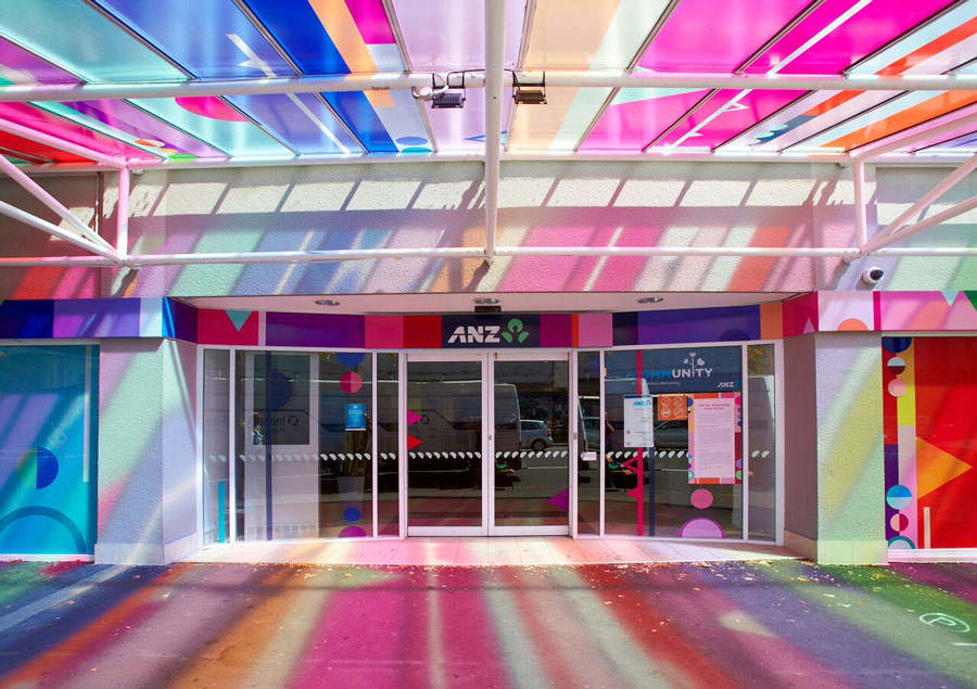
Rhapsody by Whybin/TBWA – Silver in Colour Award
ANZ are strong believers in diversity, inclusion and respect and this year Whybin/TBWA decided to show it by commissioning artist Shannon Novak to redesign the exterior of the Ponsonby 3 Lamps branch.
“When I was approached to develop this work for Pride, the first thing that entered my mind was colour with pride being about showing the vibrant and diverse colours of our community to the world,” says Novak.
“This then led to the title of the work, Rhapsody, which in music is a one-movement work, free-flowing in structure, featuring a range of highly contrasted moods, colour, and tonality. This colour range representing the broad spectrum of individuals that shine within our fantastic community.”
We’ve Changed by RUN – Silver in Self Promotion
Changing the name of an agency is a process in itself, but it was especially difficult for RUN (formerly Designstein) who were trying to convey that they were no longer just a design firm but a full service advertising agency.
To articulate this change they decided to use a face-swap app as a catalyst for the idea behind their We’ve Changed repositioning campaign. A visually arresting face-swapped image of the company directors demonstrated the change on their website.
The launch event then used face swap technology on guests including clients, family and friends along with handheld printouts of celebrity faces to add to the fun making for an engaging and original twist on the usual cliché.
See all the winners at bestawards.co.nz
Share this Post

