AUCKLAND, Today: The Out of Home Industry launched its very first, The Speccies Awards in 2024, celebrating the creative talents in advertising across New Zealand. Today, the Q1 finalists were announced, ready for the end-of-year voting across several categories.
Best Use of Technology/Data
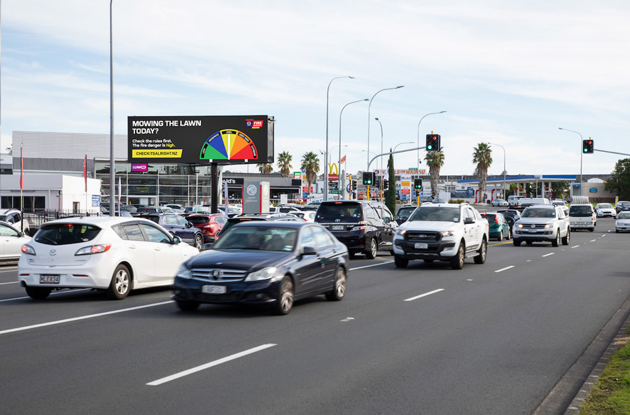
Advertiser: Fire & Emergency NZ
Campaign Title:‘Check it’s alright, before you light’
Creative Agency: Motion Sickness, Latch
Media Agency: MBM – Kaitlin Mitchell, Keila Bituin and Tyler Crawford
Out of Home Format/s: Large format Digital Billboards & Petrol Station Screens
Campaign Details: Fire and Emergency aimed to increase awareness and education of fire prevention and wildfire warnings to engage with two distinct groups: locals who are naive to the risk of wildfire and those visiting rural areas who are less competent with recreational fires. Teaming up with Hivestack, they ran a fully automated, geo-targeted dynamic creative to convey the level of fire danger in a particular area.
Judges’ Comments: We chose ‘Check it’s all right’ as the winner of the Best Use of Data & Technology because it took a well-known, highly distinctive yet highly static asset and modernised it in a way that’s incredibly simple for New Zealanders to understand and deliver to the campaign objective.
The magic and complexity in the use of data & technology were done with purpose rather than simply ‘because they could’, resulting in the use of Out of Home being both an advertisement and a utility for Fire and Emergency NZ. For future entries into the Data & Technology category, we’d love to see more examples of the media and the creative working together, where the media is finding new and interesting ways to leverage data sources, and the creative is enhancing its impact with powerful copy, bespoke to the placement.
Out of the Box
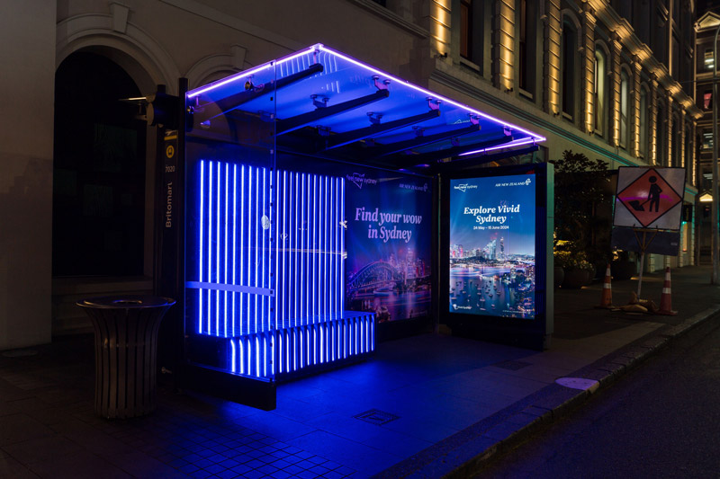
Advertiser: Air New Zealand & Destination NSW
Campaign Title: Find your wow in Sydney
Creative Agency: FCB – Augusta Mercer
Media Agency: Dentsu
Out of Home Formats: Street Furniture Special Build
Campaign Details: Build awareness of the Vivid Sydney Festival and encourage audiences to book non-stop flights with Air New Zealand through a uniquely visual creative that utilises the entire Street Furniture format for maximum impact and engagement
Judges’ Comments: We loved Air NZ’s use of neon light strips to replicate and celebrate the Vivid Sydney festival, a key call-out of their Sydney-focussed creative message. This lighting effect was bold and impactful, ensuring the execution captured as much (if not more) attention at night as during the day.
The extensive use of this lighting effect to wrap the full height of the shelter was what made this execution stand out to judges. Moving forward, we would like to see such effects pushed further, whether through greater interactivity that fuse the offline and virtual worlds, or through innovative extensions that transcend the fixed space of the asset.
With the category being ‘Out of the Box’, advertisers should use formats in new, unexpected ways that capture more imagination and blur the lines between art and advertising.
Best Use of Channel
Advertiser: McDonald’s
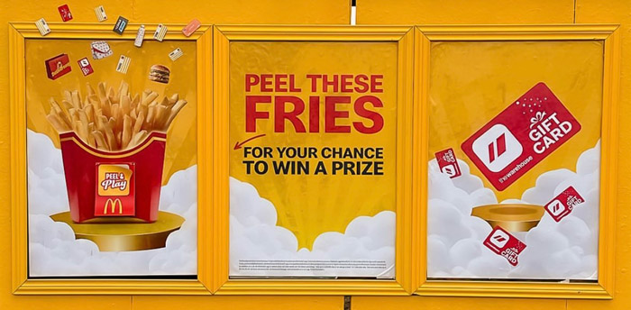
Campaign Title: Surprize Fries
Creative Agency: DDB
Creative Director: Jenny Mak
Art Director: Conal Wilson
Copywriter: Ryan Greeves
Media Agency: OMD
Business Director: Jen Hilliar
Business Manager: Mark Robinson
Account Manager: Reilly Sadowski-Synnott
Out of Home format/s: Interactive Street Poster takeover + Large Format Digital Billboards and Digital Street Furniture
Campaign Details: This was the inaugural Surprize Fries campaign in NZ, and as such, McDonald’s needed to build comprehension of the new mechanic as well as generate hype and excitement. A high-impact takeover with peelable stickers was created so that consumers could peel and scan for their chance to win a prize within the My Macca’s App.
Judges’ Comments: We thought that McDonald’s maximised its impact in this channel by adding a level of interactivity and engagement to the execution. The work was crafted for the placement, successfully driving awareness and unpacking the offer for the consumer. We’d like to see future entries into this category that show an innovative and creative use of the channel. Answering how an idea is applied to the channel/channels to maximise the impact of the work. We encourage work that isn’t a simple copy-and-paste of visual assets and messaging.
Be Seen
Advertiser: Mars
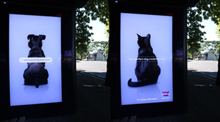
Campaign Title: Whiskas – Meowzer
Creative Agency: Colenso BBDO
Media Agency: Essence MediaCom
Out of Home Formats: Retail and Street Furniture Digital
Campaign Details: The whole world wants a dog. But people’s lives don’t always align with responsible dog ownership.
Search data reflects this, with people searching for impossibly low-maintenance dogs: that don’t need exercise, training, or can stay home alone, inside a small apartment.
The perfect dog doesn’t exist. So, WHISKAS created it – The Meowzer. A new breed of dog designed to get more cats adopted. By rebranding shelter cats as Meowzers, we showed the world that everything they’re looking for in a dog, can be answered by a cat.
Judges’ Comments: “There’s a simplicity to the Whisker’s work that demands attention, not in a shouty way, but in pure intrigue. ‘Why is the dog looking the wrong way?’ At this point, you have us, and the simple Q & A delivers a smile and ensures you are not just seen but heard. We hope to see work in the “Be Seen” category that goes beyond wallpapering the town. In a crowded room, the individuals who manage to demand your attention are the ones you remember.
OOHMAA expresses gratitude to our esteemed judges: Nick Worthington, Aaron Turk, James Davidson, and Josh Gurgiel. Your time and contributions are greatly valued – whakawhetai ki a koe.
Congratulations to all finalists! We eagerly anticipate the caliber of nominations in the upcoming Q2 round, opening on June 17th and can be submitted here.
Share this Post

