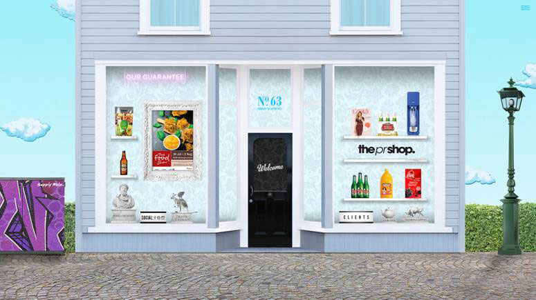
Leading consumer PR agency the pr shop has launched a new website to showcase its “spirit, personality and experience”.
“The site – developed by Auckland design & digital agency Supply – bucks the trend for html templates and provides emotional depth and personality, reflective of the pr shop as an agency,” says the pr shop director Sally Frewin.
Supply CD Piri Tukere said: “It’s got everything you’d expect from a modern website, however, it’s how these elements have been combined that make the website immersive and potentially groundbreaking from a content and creative perspective.
“There’s been some discussion recently among designers that the constraints of best-practice responsive sites have led to websites becoming somewhat homogeneous. While this makes for rock-solid and sometimes beautiful minimal sites across platforms, it may be that this does not always serve in the best interest of the character of the clients’ brand.
“Working with the pr shop’s brief to make something full of individualism, Supply has endeavoured to make something unique and a little challenging.”
“From a technology viewpoint the website isn’t really breaking any new ground – it has images, text, video. Everything you’d expect from a modern website. However it’s how these elements have been combined that make the website immersive and potentially groundbreaking from a content and creative perspective.
“There is a much higher degree of technical application and development in this website than you would find in a typical website – it’s got some serious smarts going on in the background to make sure all of the dynamic content coming from the content management system scales and adapts to different browsers sizes for instance.”
“In this age of mobile-first website design where html templates and cookie cutter creative ideas have strangled the life out of individuality and ideas it’s nice to see a website that has a some emotional depth to the design and the ideas behind that design.
Sally Frewin said: “We gave Supply a tough brief – made tougher in that we hadn’t grown out of love with our first website, which had stood the test of time over the last decade.
“We are really happy with the result, largely because it’s unlike anything else we have seen online.”
Share this Post


